Building a new brand identity for the security pioneer
Palo Alto Networks takes on the world’s toughest cybersecurity challenges. With a set of category-redefining products on the way, CEO Nikesh Arora wanted to reshape the brand. How could one visual language capture the strength, flexibility, and integration of a growing portfolio?
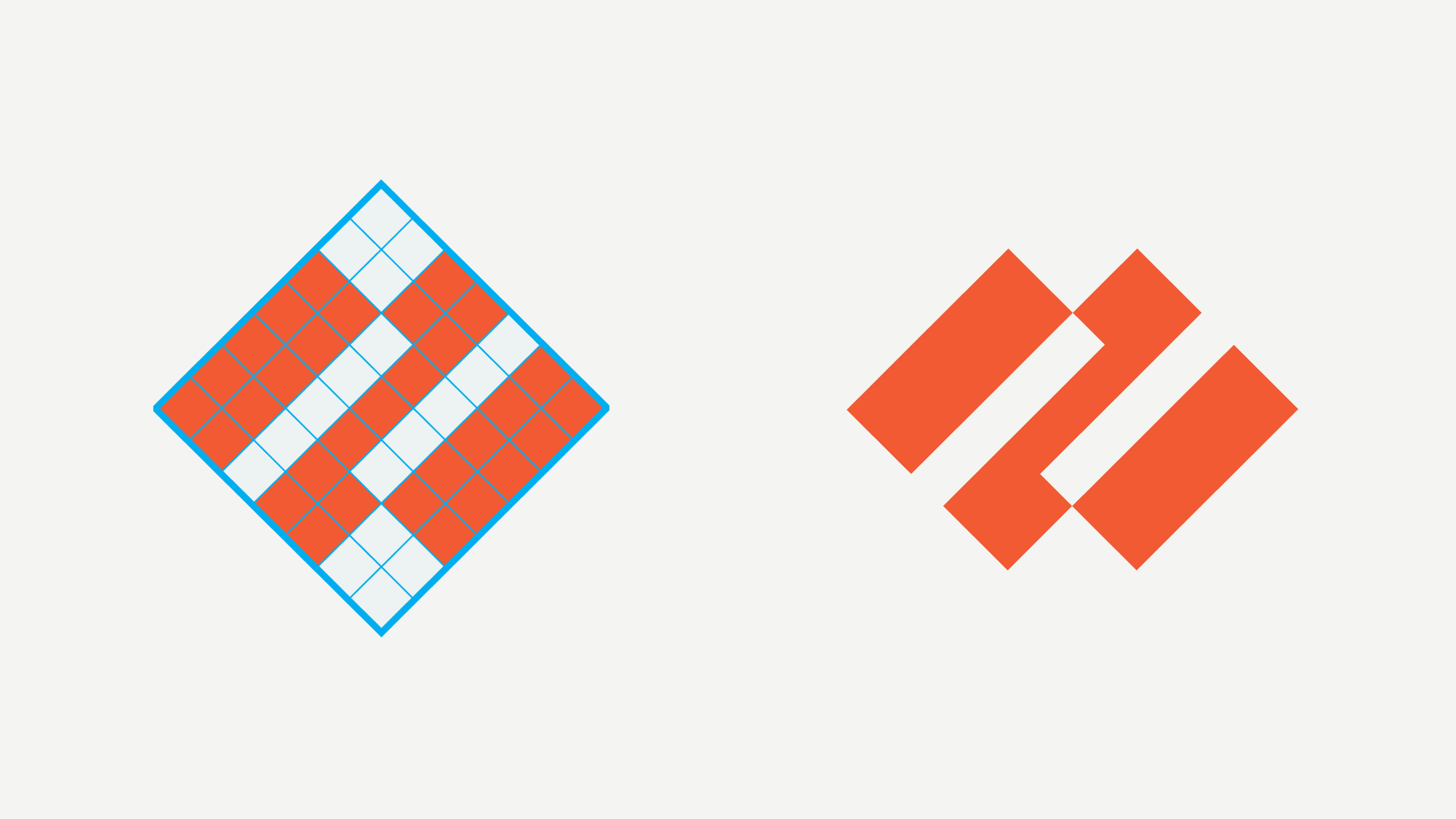
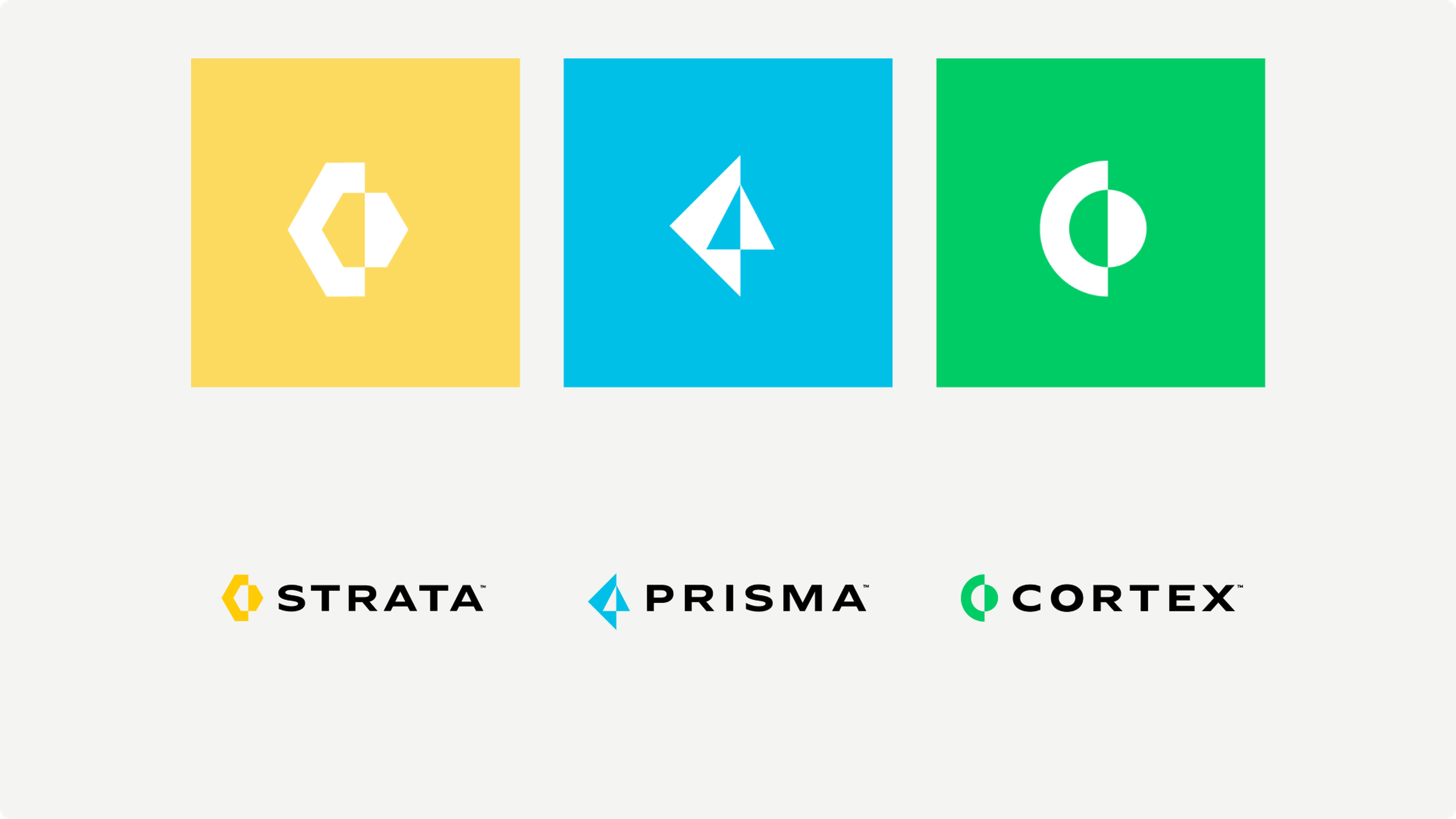
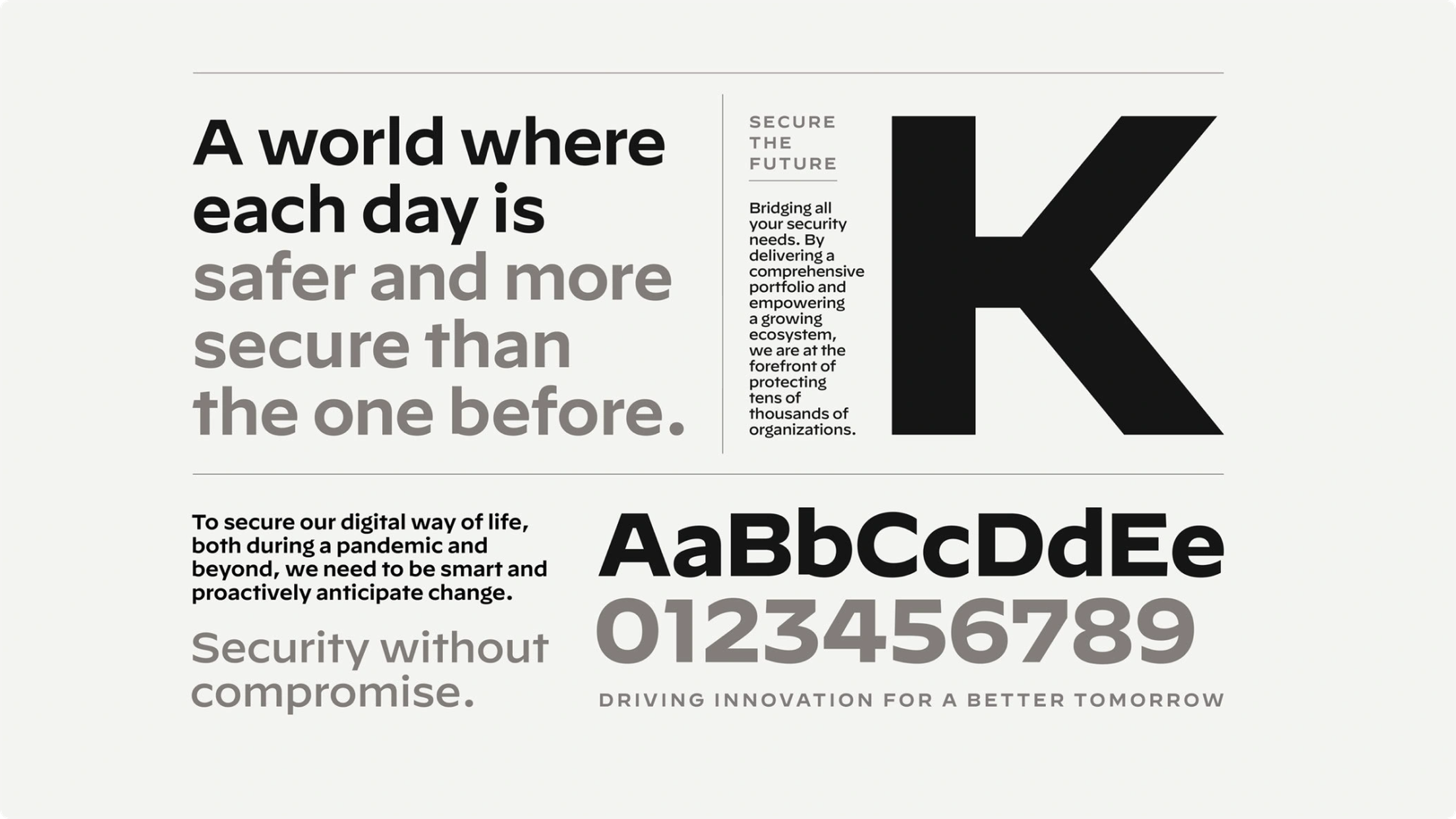
We began by studying the company’s legacy, where we found inspiration that shaped everything we built. The new brand mark unites three converging shapes, one for each product family. We named the families — Strata, Prisma, Cortex — and gave each its own glyph and color. A typographic system built on Hoefler & Co.’s Decimal typeface, inspired by watch dials, keeps information-dense screens readable. The new identity rolled out across the company’s website, branded materials, and campuses worldwide.

The company’s mission has always been to ensure cybersecurity for everyone; any new logo and design system we created had to elevate that cause.



You may also like
See all work